
And just like that, the homepage layout and CSS styling are complete! This, despite a blackout this evening, but I was about done anyway, just some placements to finalise in the footer. Speaking of the footer, I plan to use this layout and styling for the portfolio site I was working on previously.
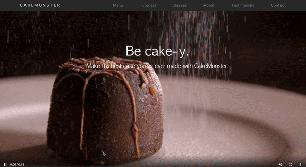
Besides the footer, I added a fixed background image to replicate the original site’s effect of movement on a particular section and added other corresponding sections. I also threw in a subtle gradient background on the final section to match same in the original site.
Today’s work wasn’t too onerous because I’d either done it before in the portfolio site, knew enough to figure it out or knew where to look for what I needed.
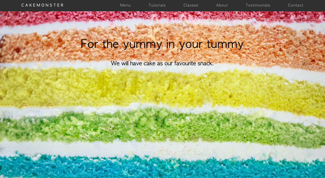
As frivolous as it is, I’m really loving how pretty the site is turning out to be:
Updated repository here.
Next up, I begin my JavaScript review with the aim of adding some of the finer details used in the original site, like the header receding when you scroll down and the text fading in and sliding down in that section with the fixed background.
Once I’ve added those effects, I’ll go ahead and build out the rest of CakeMonster’s pages, as the corresponding pages in the original site have some really cool effects (fancy sliders, headers that drop down on load, text that swaps out on click, images that expand on scroll, etc.) that I want to play around with again.
