
I think I’m just about at the finishing touches stage on this homepage. I spent today adding some impactful styling changes that I think really cleared up some of the things that were really bugging me about it from a visual perspective.
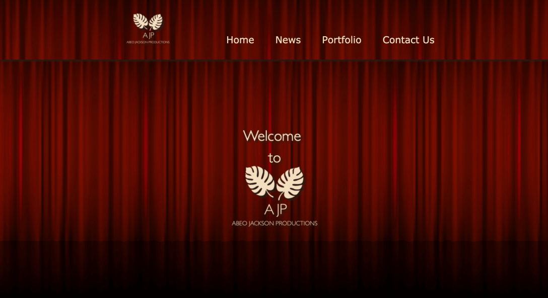
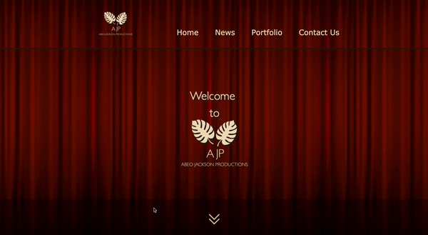
Firstly, I addressed some issues that had popped up in the responsiveness of the site, particularly relating to the header and banner. As the viewport got smaller, the curtain background image was getting repeating in weird ways in both elements when the viewport got smaller. Turns out I needed to change the background-size from “contain” to “cover” via media queries.

The next thing I stumbled across was “background-attachment: fixed;”, which really helped with the nagging feeling that the site looked like something from ’95, lol. I still have to replace the background, which I’ll work on tomorrow as I’ve finally found an icon that suits the ask so I can create a patterned background.

Then I decided to add a subtle CTA in the form of arrows inviting the viewer to click to scroll down, which would also lend an effect of the curtain rising. Unfortunately, management of the speed will have to wait until JS review.
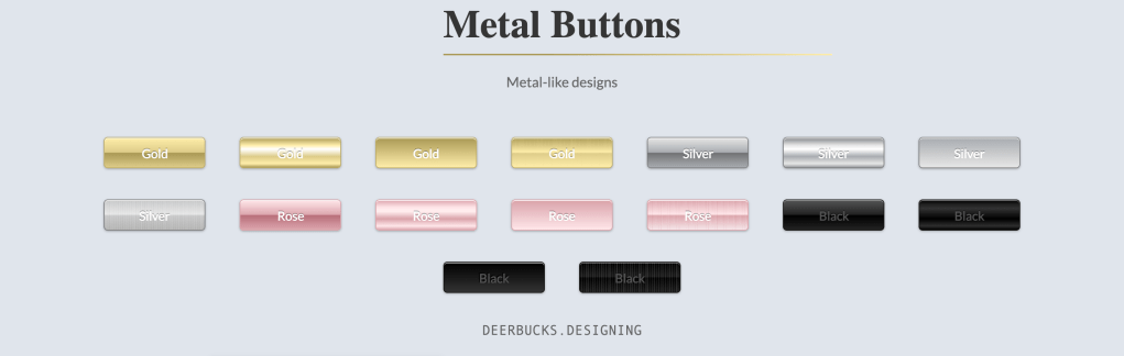
Then I addressed the button styling. Gold was specifically requested and, although it’s included in the color scheme in two shades, I wanted to add a metallic effect to the button using those colours and a gradient, so I consulted Dr. Google and found this gorgeous button styling by Yuhmyan on codepen:

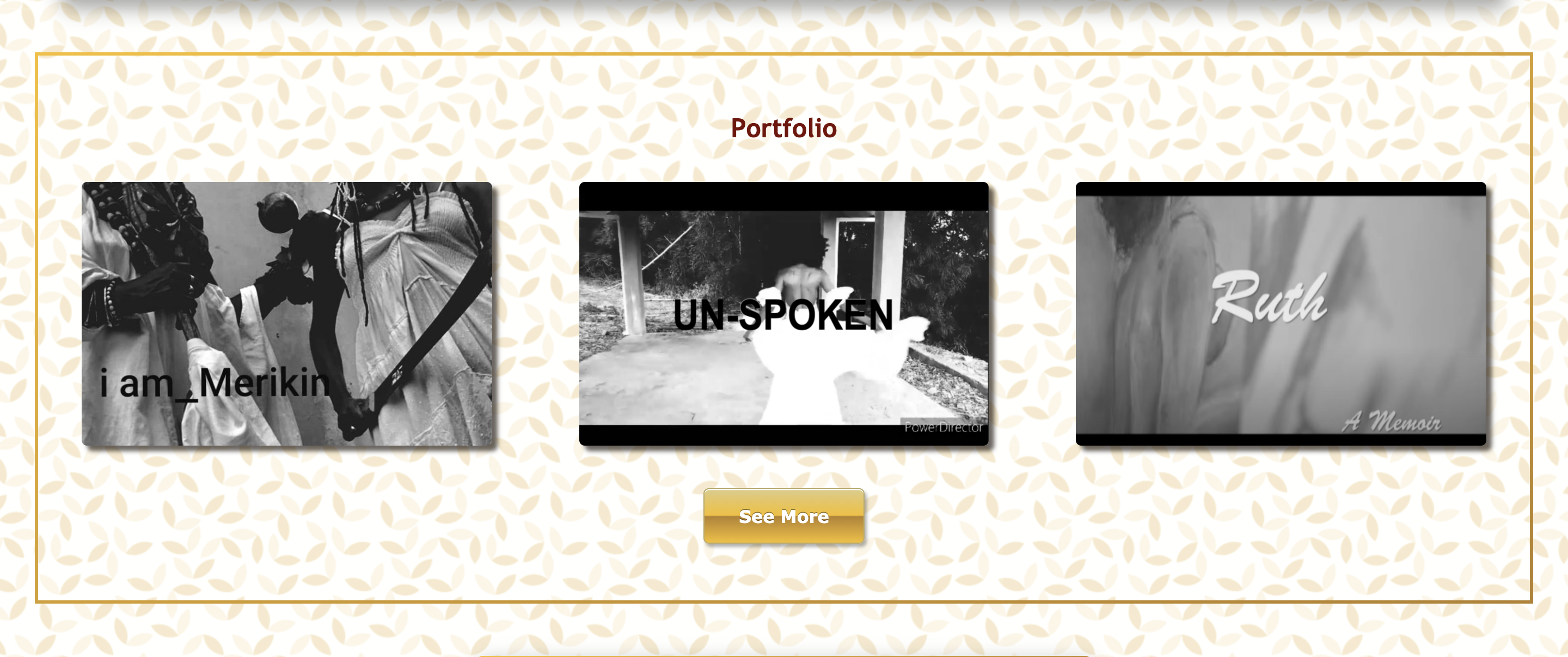
I considered myself done for the day at that point… until I was about to share an update and realised that I could add even more bling in the form of a border. I wasn’t sure how to go about the gradient border, but I found this simple gold border by Tasi at codegrepper.com that was just what I was looking for, except for the fact that it didn’t accommodate a border-radius, which I really wanted in order to tie back into shapes of the images and buttons.
So, I went hunting again and found this beautiful bordered box sterokai on github. Given how elaborate it is, I didn’t think it worked for every element (I was thinking specifically of the portfolio section, which I really wanted to keep simple so the focus would remain on the images). I ended up alternating both border styles and I think it really works well (even without the border-radius on the simpler one).

I also cleaned up my code a bit more as I went along as things were getting a bit messy when so much refactoring is going on.
Updated repository here.
Tomorrow, I’ll be making a new patterned background based on a really interesting element and I have some work to do on the logos I duplicated (turns out the original logo on which I based them mistakenly put spaces in the title).

[…] along quite well! I finally found a background that worked (think marble) and I redid the logos as planned. After that, I added an “About Us” section to the header and home page with lorem text […]
LikeLike