
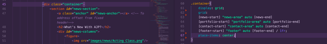
I’ve finally “finished” the grid positioning on my new project after chipping away at it bit by bit for what felt like ages! I mixed in a little flexbox for the header and footer, since nesting grids for those areas felt like overkill. I also used it for the banner, given that I wanted it to stretch across the length of the screen rather than being limited to my container div.
css-tricks.com came to the rescue once again with helpful tips on making sure my grid was fully responsive.
I know I’ve said it before, but it really helped to apply things as I reviewed them. Part of the reason it took so long is because I kept tweaking the properties just to make sure I understood what they did and what kind of bugs could pop up depending on how I used them, so it definitely wasn’t time wasted.

Next up is a part I’m particularly nervous about: design. As I’m doing this particular project for a friend (assuming she likes it), I really want to make sure it looks good, but design in general isn’t exactly my forte (I much prefer to stick to functionality), so I’ll definitely be doing some heavy research on this one.
