I won’t lie, I dreaded the responsive design/media query portion of my review plans because I recall being somewhat confused about it the first time around, but I had so much fun with it this time! It DEFINITELY helps to be applying it to a project as I review (which is what I should’ve done the first go-round).
Before I jumped into media queries, I did a little more box model review, specifically in relation to positioning, because the placement of that submit button at the bottom of my form was aggravating the life out of me. Turns out all I needed to do was:
display: block;
margin: auto;
… and it jumped right into the centre of its parent container. 🤦🏾♀️
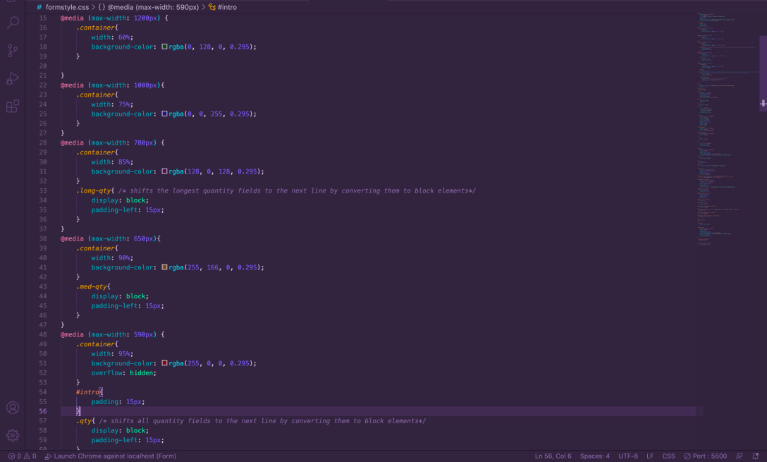
Once I had that settled, I moved on to media query review. I’d already re-read my notes and I kinda recalled the concept, but I needed a little more, so I went hunting for some clarity into breakpoints and exactly how media queries are applied.
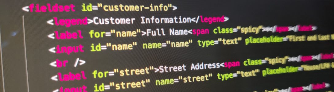
With that understanding under my belt, I started writing the CSS, dropping in background colors as I went for visibility into the changes I was making at each screen size. I also wrapped <span> elements around some of the <label> and <input> elements in my form so I could ensure that the “Quantity” labels wrapped with their fields to ensure clarity for the user. I ended up having to create three different classes to handle the different requirements for wrapping.
When the <br /> elements started creating spacing havoc with my narrowest screen size, I did a little googling and discovered that it’s possible to style them a bit to reduce their heights. It occurs to me that I probably could have just wrapped them in <span> elements as well and styled them as blocks, but this way seemed cleaner, code-wise. I, of course, had to assign them to a class as well to ensure that all of my <br /> elements weren’t affected:
.details-breaks{
display: block; /* adds a width to br element */
content: ""; /* clears default height */
margin-top: 0; /* zeroes top margin height */
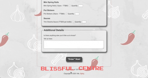
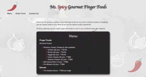
}The end result:
 undefined